About the Project
This global SaaS product had grown in complexity over time, with multiple user profiles and navigation flows supported by UI elements and components that had not yet been fully documented or standardized.
With the continuous evolution of the product and the introduction of new features, challenges emerged around visual consistency, component reuse, scalability, and delivery speed across teams.
Problem
Interfaces were evolving rapidly, but without a shared library of components, tokens, and patterns. This generated visual inconsistencies, duplicated solutions, and increased the effort required from both design and development.
Goals
Create a scalable foundation that could responsively accommodate future product additions for web and mobile.
- Accelerate access to and use of components by designers, PMs, and engineers;
- Reduce friction in cross-team workflows;
- Increase interface consistency and quality;
- Promote product and system scalability;
- Create a reference baseline for alignment between design and engineering.
My Role
I led the Design System initiative within the product. I conducted a comprehensive audit of UI elements, components, pages, and assets used across different parts of the product.
From this analysis, I defined the system's taxonomy and established naming conventions to resolve visual inconsistencies, increase scalability, and reduce friction during implementation with the development team.
I also structured the Design System's underlying logic to support both current needs and future product evolutions. In collaboration with the design team, I implemented a token-based system for colors, spacing, and typography, reducing inconsistencies and simplifying updates at scale.
Steps
- Audit of existing UI patterns and components;
- Benchmarking and Design System strategy definition;
- Creation of reusable and scalable components;
- Implementation of variables and modes;
- Application of variables for dynamic control in advanced prototypes;
- Definition of conventions and taxonomy for components and tokens;
- Structuring of foundations and design tokens;
- Creation of primitive tokens, semantic tokens, and semantic extensions;
- Close collaboration with design and development teams;
- Creation of a proof of concept (POC) project for token integration into designs.
Benchmarking
- Uber Base;
- Material Design;
- Shopify Polaris;
- Adobe Spectrum;
- Salesforce Lightning Design System.
Logic and Architecture
Components were built using Figma features such as Auto Layout and Component Properties to ensure element responsiveness across web and mobile devices. The properties used were Text, Boolean, Instance Swap, and Variant.
To automate and accelerate the creation of new designs, variables were applied to attributes such as width, min-width, and max-width. Variables associated with Modes were designed to dynamically control components when using desktop and mobile templates, as well as to build high-fidelity prototypes.
Some of the Components Created:
- Main navigation (Sidebar and Navbar);
- Contextual navigation (Page Header);
- Buttons;
- Form fields;
- Widgets;
- Cards.
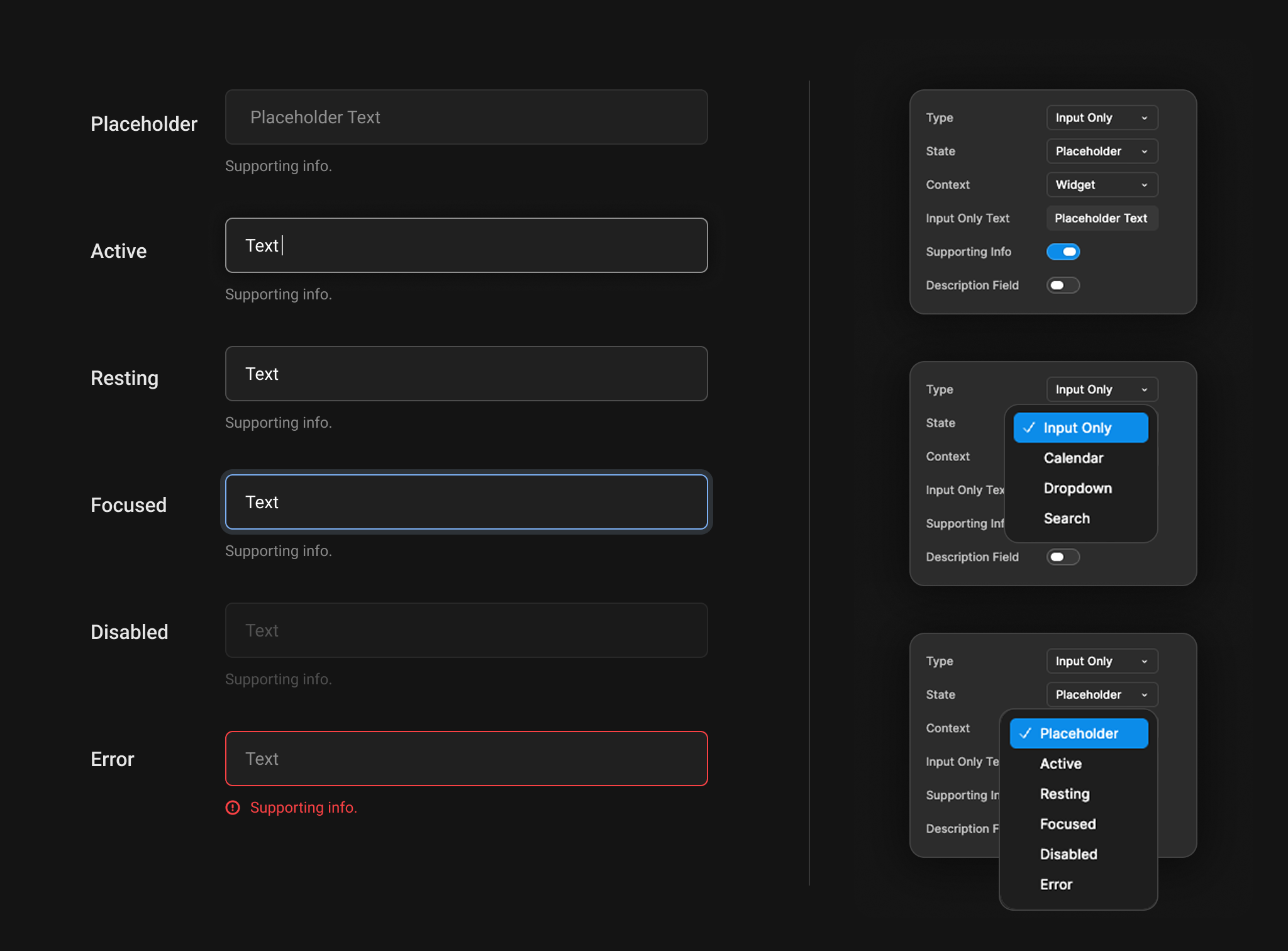
Form Field States
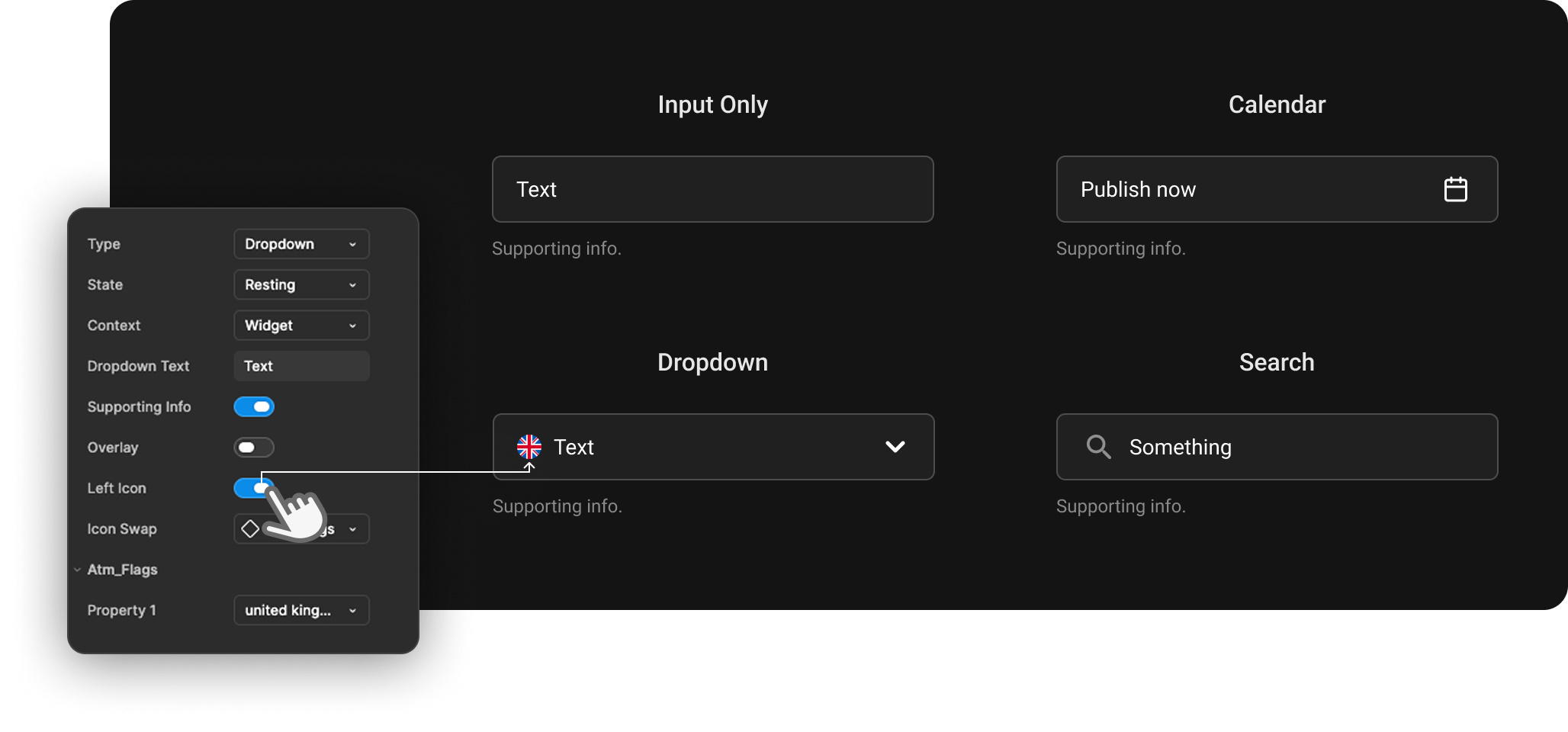
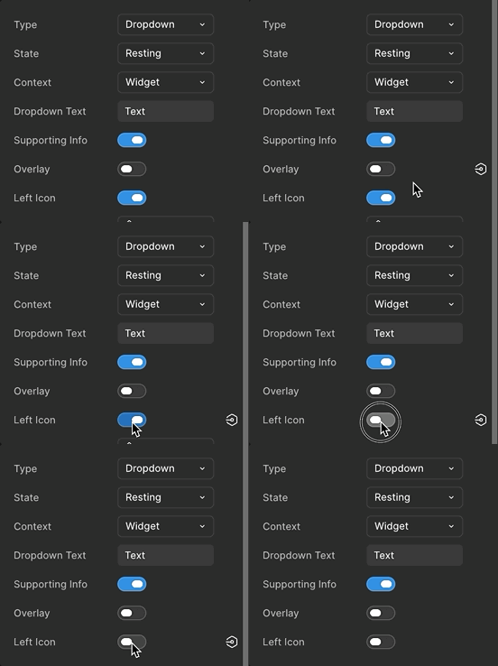
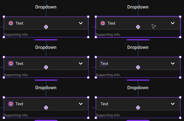
Tokens
Taxonomy: The "What-Where-How" Model
The naming structure chosen to classify and name tokens semantically was the "What-Where-How" model.
- What: Which element or semantic concept the value refers to;
- Where: In which context, screen, area, or state this element is placed;
- How: What the exact function, variation, or hierarchy is.
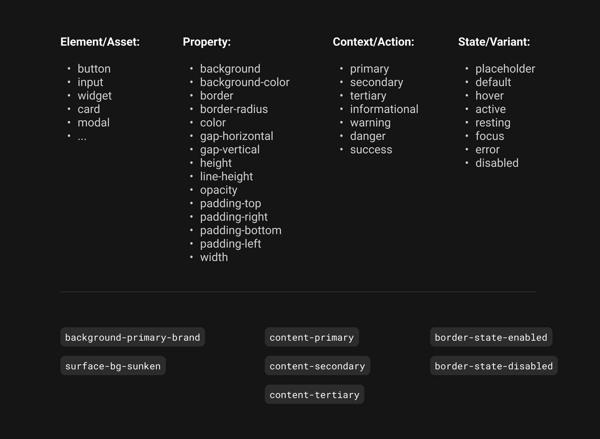
Taxonomy - The "What-Where-How" Model
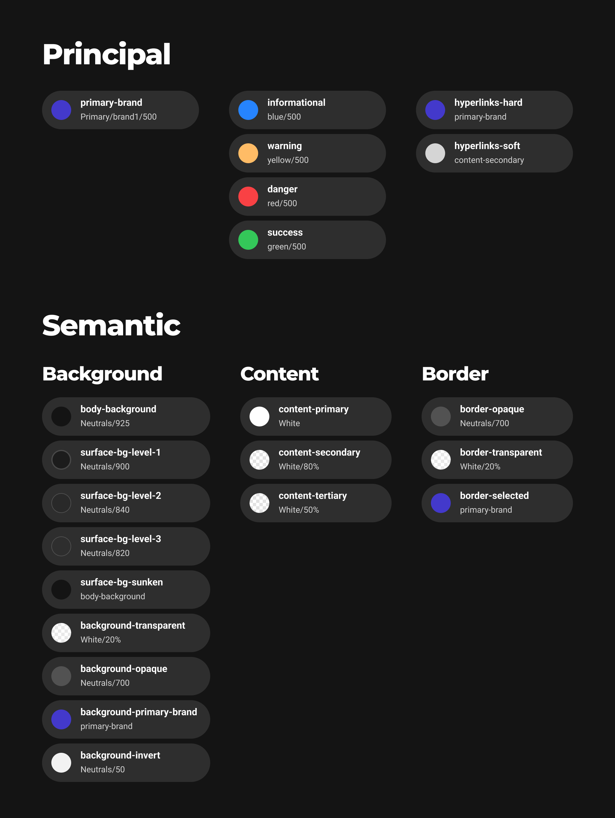
Primitive Tokens
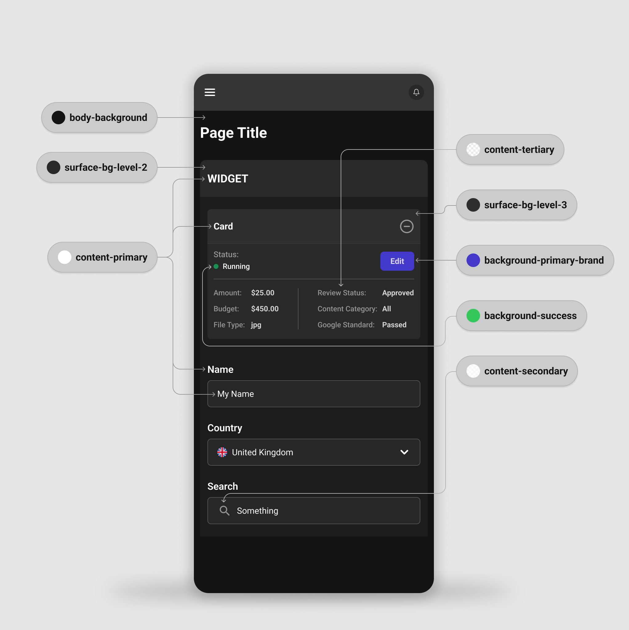
Tokens Applied to the Interface
Outcomes
Workflow:
- Accelerated design workflows and solution exploration;;
- Consistent reuse of components such as inputs, widgets, cards, and modals;
- Creation of a changelog for tracking decisions and system evolution;
- Creation of automated templates using variables, enabling adaptation across devices (e.g., generating mobile layouts from desktop designs by switching Modes).
Scalable Foundation:
- Establishment of scalable foundations for product evolution and future multiple variations;
- Implementation of variables and modes for dynamic component control.
Advanced Prototypes and User Testing:
- Creation of advanced high-fidelity prototypes with dynamic content and visibility control;
- Conducted user testing and design iterations;
- Close collaboration across design, product, and research teams.
Design and Engineering Relationship:
- Significant improvement in collaboration and alignment between design and engineering;
- Built a design-to-code workflow using a token-based foundation.
Tools
 Figma
Figma